Your cart is currently empty!

What font does Toyota use?
Toyota’s branding is built on the pillars of reliability, innovation, and customer trust, making it one of the most respected automotive brands globally. The brand’s logo, featuring three overlapping ovals that form a stylized “T,” symbolizes the union of the customer, the vehicle, and the company, reflecting Toyota’s commitment to quality and customer satisfaction. Toyota’s branding emphasizes durability and advanced engineering, often highlighting the brand’s reputation for producing long-lasting, fuel-efficient vehicles. The company’s focus on innovation is evident in its push towards hybrid and electric vehicles, reinforcing its image as a forward-thinking and environmentally conscious brand. Through consistent messaging that underscores dependability and technological progress, Toyota has established itself as a leader in the automotive industry, trusted by millions of drivers worldwide.

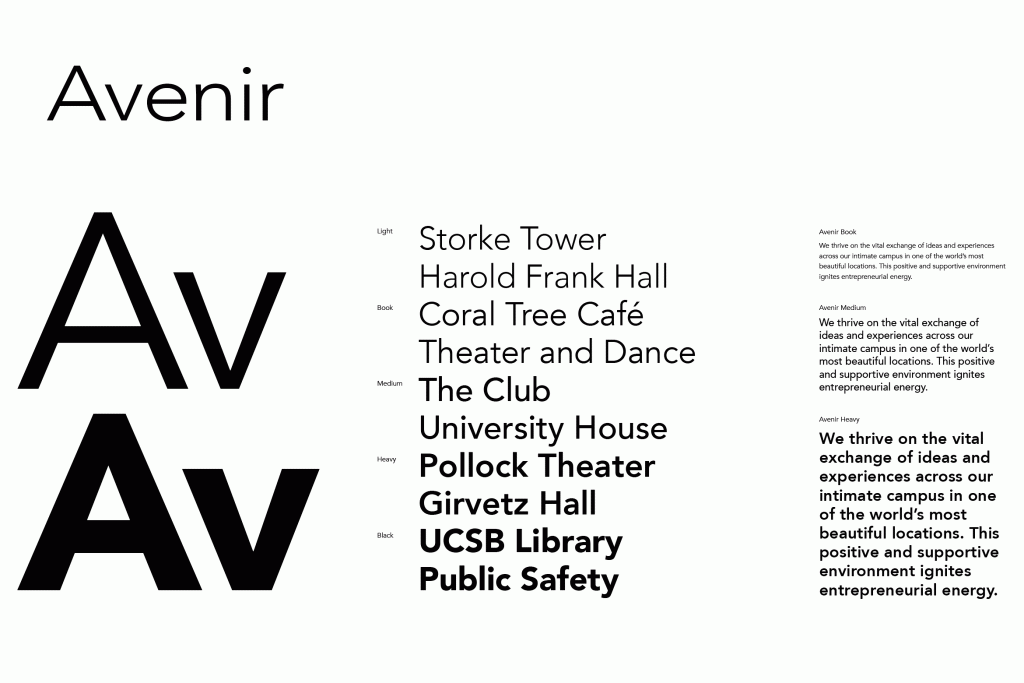
In drawing the Avenir® typeface, Adrian Frutiger looked to both the past and the future for inspiration. His goal was to reinterpret the geometric sans serif designs of the early part of the 20th century in a typeface that would portend aesthetics of the 21st century. He succeeded handsomely. In doing so, Frutiger added a bit of organic humanism to the design, freeing Avenir from the rigid geometric overtones of the earlier designs. Avenir is employed on signage at Dallas Fort Worth and Hong Kong international airports. The city of Amsterdam adopted Avenir as its corporate typeface in 2003. The original Avenir family is made up of designs with gradual weight changes in order to satisfy the needs of specific text applications. While the book and light weights have similar stroke widths, the book weight is well suited for body text, whereas the light was designed for captions and subhead text.
by
Tags:

