Nutella’s branding is rooted in the warmth and joy associated with indulgence and family moments. Known for its distinctive jar, with the red script logo and white label featuring an image of the spread, Nutella has become synonymous with breakfast and sweet treats. The brand emphasizes the quality of its ingredients, such as hazelnuts and cocoa, creating an aura of authenticity and tradition. Nutella’s marketing often highlights the emotional connection consumers have with the product, evoking nostalgia and the pleasure of simple, comforting indulgence. Through consistent messaging and a recognizable visual identity, Nutella has established itself as a beloved global brand that embodies the idea of spreading happiness.

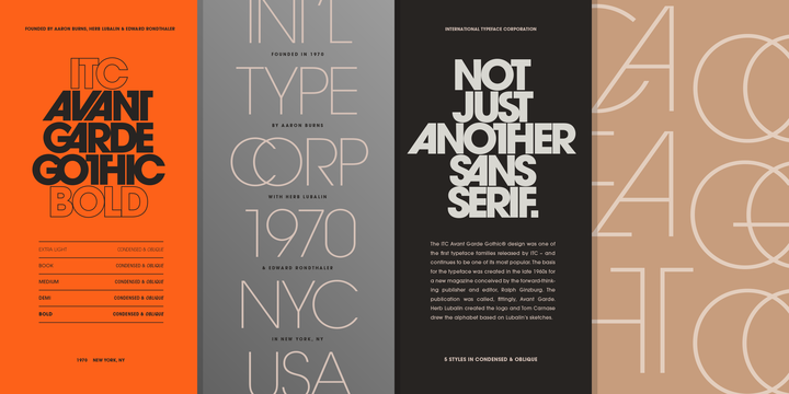
ITC Avant Garde® Gothic
Designed by Edward Benguiat, André Gürtler, Herb Lubalin, Tom Carnase, Erich Gschwind, Christian Mengelt. ITC Avant Garde Gothic is a font family based on the logo font used in the Avant Garde magazine. Herb Lubalin devised the logo concept and its companion headline typeface, then he and Tom Carnase, a partner in Lubalin’s design firm, worked together to transform the idea into a full-fledged typeface. The condensed fonts were drawn by Ed Benguiat in 1974, and the obliques were designed by André Gürtler, Erich Gschwind and Christian Mengelt in 1977. The original designs include one version for setting headlines and one for text copy. However, in the initial digitization, only the text design was chosen, and the ligatures and alternate characters were not included. The font family consists of 5 weights (4 for condensed), with complementary obliques for widest width fonts. When ITC released the OpenType version of the font, the original 33 alternate characters and ligatures, plus extra characters were included.


