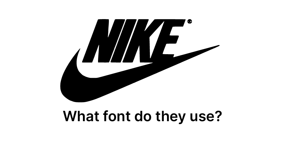
Nike’s branding embodies athleticism, innovation, and empowerment, with its typeface choice playing a crucial role in conveying these values. The company utilizes a bold, custom sans-serif typeface that is clean and dynamic, reflecting its reputation as a leading sportswear brand. The strong, angular letterforms convey a sense of energy and movement, aligning perfectly with Nike’s mission to inspire athletes of all levels. This typeface ensures clarity and legibility across various platforms, from product packaging to advertising campaigns. Combined with the iconic Swoosh logo and a vibrant color palette, Nike’s typography reinforces its identity as a forward-thinking brand that champions performance, motivation, and a passion for sport.

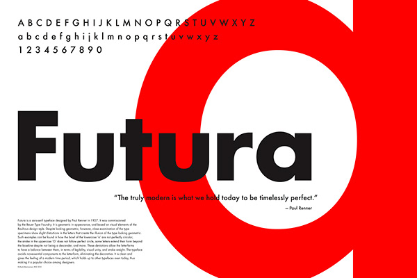
Futura
Futura is a geometric sans-serif typeface designed by Paul Renner in 1927, embodying the modernist principles of the Bauhaus movement. Renner’s design emphasizes clean, minimalist forms based on geometric shapes, particularly circles, triangles, and squares, creating a sense of precision and balance. Its timeless and versatile aesthetic has made Futura a favorite for branding, advertising, and editorial design. The typeface conveys a forward-thinking and innovative tone, which has appealed to iconic brands and projects throughout the decades. With its sharp lines and proportional design, Futura remains a staple in typography, celebrated for its ability to adapt seamlessly to both classic and contemporary applications.


