Coinbase’s branding is built on the principles of trust, accessibility, and innovation in the digital financial landscape. As a leading cryptocurrency exchange platform, Coinbase projects a clean, modern, and user-friendly image, making the complex world of cryptocurrencies more approachable for both novice and experienced users. The brand’s visual identity, characterized by a minimalist design with a bold blue color scheme and simple logo, conveys reliability and technological sophistication. Coinbase emphasizes security and transparency, aiming to establish itself as a trusted gateway for individuals and institutions to navigate the cryptocurrency market. Through its branding, Coinbase seeks to demystify digital finance, positioning itself as a leader in the evolving fintech space by empowering users to invest, trade, and manage their crypto assets with confidence.

Explore the Largest selection of Professional Fonts for any project!
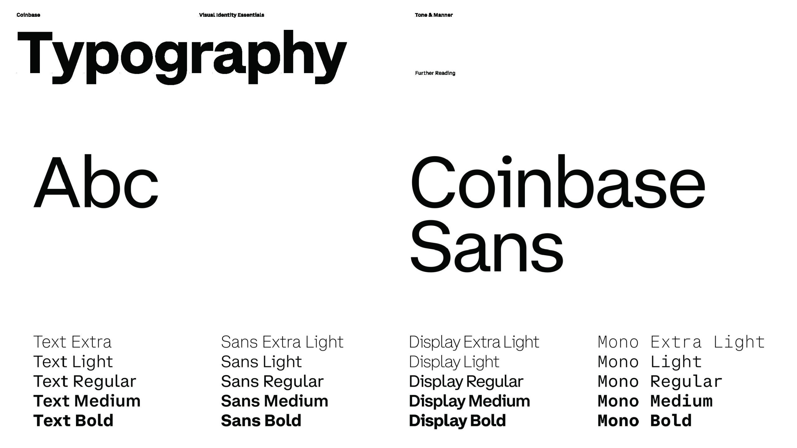
Coinbase Sans
Designed by Moniker. Our design approach struck a balance between the trusted elements of the financial world and the need for greater humanity & accessibility. The typography is inspired by the monospaced typefaces historically used in financial documents and wayfinding symbols while the layout system allows for all the flexibility and dynamism of a global market that stays open twenty four hours a day, seven days a week.
Note: This font is not available for public usage.
The Old Coinbase Logo
Coinbase’s original branding was rooted in simplicity and accessibility, designed to make the emerging world of cryptocurrencies more approachable to the general public. The early visual identity featured a straightforward, sans-serif logo with a soft blue color palette, evoking a sense of security and ease. This minimalist approach was intentional, aiming to build trust among users who were new to digital currencies by stripping away the complexities often associated with the technology. Coinbase’s branding emphasized user-friendliness and transparency, helping to position the platform as a reliable and accessible entry point into the world of crypto.
Explore the World’s Marketplace for Design!
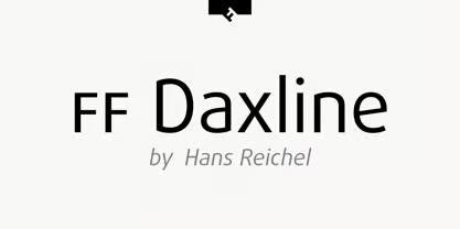
FF Daxline
German type designer Hans Reichel created this sans FontFont in 2005. The family has 14 weights, ranging from Thin to Black (including italics) and is ideally suited for advertising and packaging, book text, editorial and publishing, logo, branding and creative industries, poster and billboards, small text as well as web and screen design. FF Daxline provides advanced typographical support with features such as ligatures, small capitals, case-sensitive forms, fractions, super- and subscript characters, and stylistic alternates. It comes with a complete range of figure set options – oldstyle and lining figures, each in tabular and proportional widths. As well as Latin-based languages, the typeface family also supports the Cyrillic and Greek writing systems.
This FontFont is a member of the FF Dax super family, which also includes FF Dax and FF Dax Compact.