Adidas branding is synonymous with innovation, performance, and style. The brand’s iconic three-stripe logo, introduced in 1949, is instantly recognizable and represents a legacy of athletic excellence. Adidas positions itself as a leader in sportswear by combining cutting-edge technology with a strong sense of fashion, appealing to both professional athletes and lifestyle consumers. Their marketing emphasizes the fusion of sport and culture, often collaborating with high-profile athletes, designers, and influencers to create products that transcend the boundaries of sport. This approach has solidified Adidas as a global symbol of quality, performance, and contemporary style.

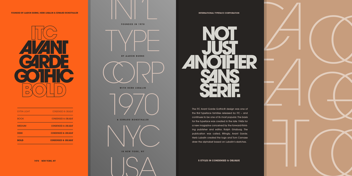
ITC Avant Garde® Gothic
Designed by Edward Benguiat, André Gürtler, Herb Lubalin, Tom Carnase, Erich Gschwind, Christian Mengelt. ITC Avant Garde Gothic is a font family based on the logo font used in the Avant Garde magazine. Herb Lubalin devised the logo concept and its companion headline typeface, then he and Tom Carnase, a partner in Lubalin’s design firm, worked together to transform the idea into a full-fledged typeface. The condensed fonts were drawn by Ed Benguiat in 1974, and the obliques were designed by André Gürtler, Erich Gschwind and Christian Mengelt in 1977. The original designs include one version for setting headlines and one for text copy. However, in the initial digitization, only the text design was chosen, and the ligatures and alternate characters were not included. The font family consists of 5 weights (4 for condensed), with complementary obliques for widest width fonts. When ITC released the OpenType version of the font, the original 33 alternate characters and ligatures, plus extra characters were included.


