Groupon’s branding centers around the concept of discovery and value, positioning itself as a platform for consumers to explore new experiences and save money. The brand is known for its vibrant green color scheme and playful, straightforward logo, which reflects its approachable and consumer-friendly ethos. Groupon emphasizes the thrill of finding deals on a wide range of products and services, from dining and travel to local activities and wellness. By promoting the idea of “unlocking” opportunities, Groupon taps into the consumer desire for adventure and exploration, all while offering affordability. This branding strategy has helped Groupon carve out a niche as a go-to destination for savvy shoppers looking to enjoy life’s experiences at a fraction of the cost.

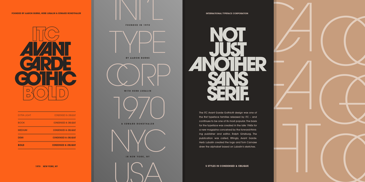
ITC Avant Garde® Gothic
Designed by Edward Benguiat, André Gürtler, Herb Lubalin, Tom Carnase, Erich Gschwind, Christian Mengelt. ITC Avant Garde Gothic is a font family based on the logo font used in the Avant Garde magazine. Herb Lubalin devised the logo concept and its companion headline typeface, then he and Tom Carnase, a partner in Lubalin’s design firm, worked together to transform the idea into a full-fledged typeface. The condensed fonts were drawn by Ed Benguiat in 1974, and the obliques were designed by André Gürtler, Erich Gschwind and Christian Mengelt in 1977. The original designs include one version for setting headlines and one for text copy. However, in the initial digitization, only the text design was chosen, and the ligatures and alternate characters were not included. The font family consists of 5 weights (4 for condensed), with complementary obliques for widest width fonts. When ITC released the OpenType version of the font, the original 33 alternate characters and ligatures, plus extra characters were included.


