Microsoft’s branding embodies innovation, reliability, and a commitment to empowering individuals and businesses through technology. The company’s logo features a clean, modern sans-serif typeface, which enhances clarity and legibility across various platforms and devices. This typographic choice aligns with Microsoft’s mission to provide accessible and user-friendly solutions, while the use of vibrant colors in the logo reflects a dynamic and forward-thinking approach. The typography is designed to evoke a sense of professionalism and trust, reinforcing Microsoft’s position as a leader in the tech industry. Overall, the combination of its modern typeface and distinctive color palette creates a cohesive brand identity that resonates with users worldwide.
Explore the Largest selection of Professional Fonts for any project!
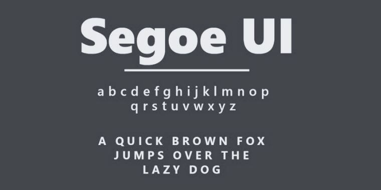
Segoe UI
Segoe UI is a modern sans-serif typeface designed by Microsoft to enhance readability and user experience across digital interfaces. Introduced as part of Microsoft’s branding and UI design, Segoe UI features clean lines, open letterforms, and balanced proportions, making it highly legible on screens of all sizes. Its subtle, humanist touch differentiates it from purely geometric sans-serifs, giving it a friendly yet professional appearance. Widely used in Microsoft products, from Windows to Office, Segoe UI reinforces brand consistency while ensuring clarity in both text-heavy applications and minimalistic user interfaces. Its versatility and accessibility make it a staple in digital typography.
Explore the World’s Marketplace for Design!