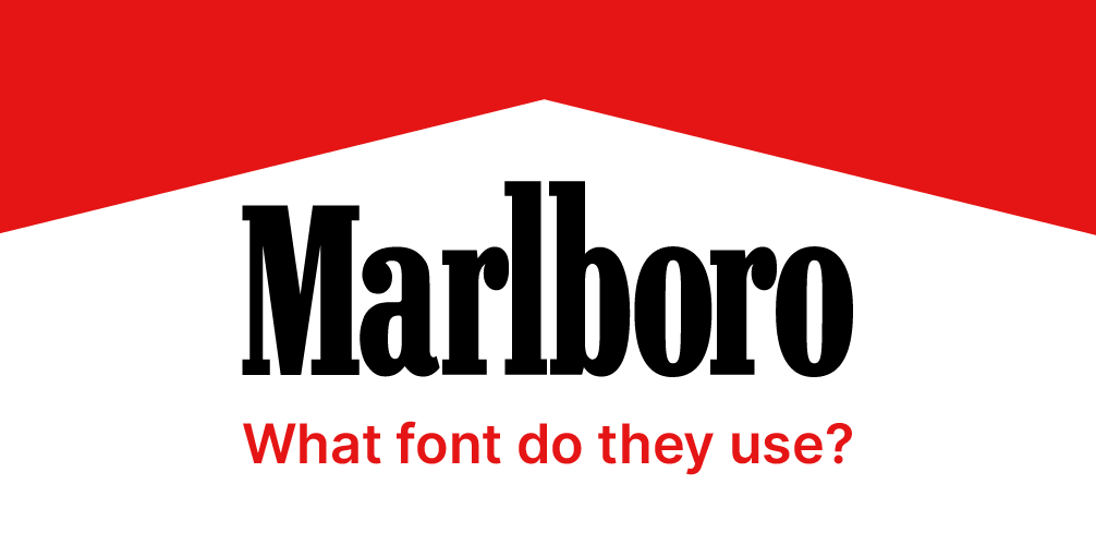
Marlboro’s branding is iconic and deeply ingrained in popular culture, representing a rugged, adventurous lifestyle associated with the American West. The brand is known for its bold, minimalist logo, featuring a distinctive serif typeface that conveys strength and reliability. The typeface choice, characterized by its classic and authoritative appearance, reinforces the brand’s image as a premium cigarette product. The prominent use of red and white in its packaging not only enhances visibility but also evokes a sense of trust and familiarity. Marlboro’s typography is complemented by its strong visual imagery, often showcasing cowboys and outdoor scenes, which further solidifies its connection to the themes of freedom and masculinity. Overall, Marlboro’s branding and typeface work together to create a memorable identity that resonates with its target audience.

Neo Contact
Neo Contact is a contemporary sans-serif typeface designed for versatility and modern aesthetics. With its geometric forms and clean lines, Neo Contact embodies a sense of clarity and professionalism, making it suitable for a wide range of applications, from branding and advertising to user interfaces and editorial design. The typeface features a balanced structure and open letterforms, enhancing legibility in both print and digital formats. Its distinct character set includes various weights and styles, allowing designers to create dynamic compositions while maintaining visual harmony. Neo Contact’s modern design and adaptability make it a popular choice for projects seeking a fresh, sophisticated typographic solution.


