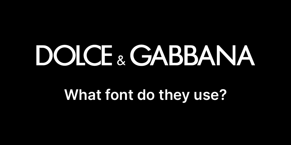
Dolce & Gabbana’s branding epitomizes luxury, elegance, and bold expression, reflecting its identity as a high-end fashion powerhouse. The company employs a sleek, modern sans-serif typeface in its logo, emphasizing sophistication and timelessness. The clean, bold letterforms exude confidence and exclusivity, aligning with the brand’s commitment to Italian craftsmanship and distinctive style. The typeface’s minimalistic yet impactful design ensures versatility across applications, from haute couture labels and advertising campaigns to digital platforms and storefronts. Paired with a monochromatic palette, often dominated by black, Dolce & Gabbana’s typography reinforces its image as a global symbol of glamour and innovation in the fashion world.

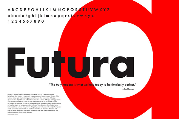
Futura
Futura is a geometric sans-serif typeface designed by Paul Renner in 1927, embodying the modernist principles of the Bauhaus movement. Renner’s design emphasizes clean, minimalist forms based on geometric shapes, particularly circles, triangles, and squares, creating a sense of precision and balance. Its timeless and versatile aesthetic has made Futura a favorite for branding, advertising, and editorial design. The typeface conveys a forward-thinking and innovative tone, which has appealed to iconic brands and projects throughout the decades. With its sharp lines and proportional design, Futura remains a staple in typography, celebrated for its ability to adapt seamlessly to both classic and contemporary applications.


