Casio’s branding reflects precision, innovation, and reliability, mirroring its reputation as a leader in electronics and timekeeping. The company employs a clean, bold sans-serif typeface in its logo and branding materials, emphasizing clarity and functionality. This typeface choice aligns with Casio’s focus on practicality and advanced technology, ensuring readability across diverse applications such as digital screens, product packaging, and marketing collateral. The typeface’s simple yet modern design underscores Casio’s commitment to delivering accessible and cutting-edge solutions in watches, calculators, and musical instruments. Combined with its monochromatic color scheme and minimalist aesthetic, Casio’s typography reinforces its global identity as a trusted brand synonymous with high-quality and dependable products.

Eurostile
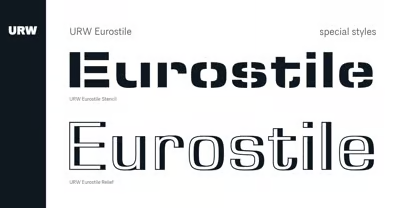
Eurostile is a geometric sans-serif typeface designed by Aldo Novarese in 1962. Known for its squared letterforms with rounded corners, Eurostile conveys a futuristic and technical aesthetic that has made it a favorite in technology, science fiction, and industrial design. Its clean and modern lines evoke a sense of precision and innovation, ideal for conveying advanced technology and forward-thinking concepts. The typeface includes various weights and styles, offering versatility for headlines, logos, and display purposes. Eurostile’s distinct, space-age design has been widely used in branding, product interfaces, and signage, becoming synonymous with mid-century modernism and the era’s optimism about technological progress. Its enduring appeal lies in its ability to balance functionality with a distinct, contemporary flair.


