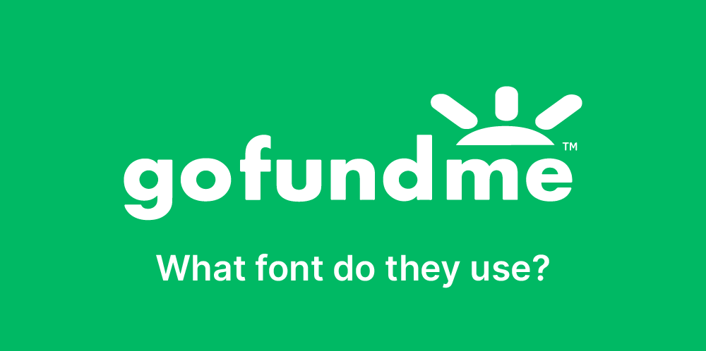
GoFundMe’s branding emphasizes community, empathy, and accessibility, with its typeface choice playing a vital role in conveying these values. The platform uses a clean, rounded sans-serif typeface that exudes warmth and approachability, aligning with its mission of empowering people to support causes and connect with others. The rounded forms and soft edges of the typeface create a sense of trust and inclusivity, making the platform feel inviting and user-friendly. This modern and legible design ensures consistency and clarity across digital interfaces, reinforcing GoFundMe’s commitment to making fundraising accessible to everyone. By pairing its approachable typeface with a vibrant and optimistic color palette, GoFundMe effectively communicates its role as a trusted and compassionate tool for collective action.

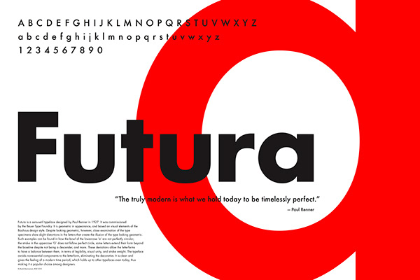
Futura
Futura is a geometric sans-serif typeface designed by Paul Renner in 1927, embodying the modernist principles of the Bauhaus movement. Renner’s design emphasizes clean, minimalist forms based on geometric shapes, particularly circles, triangles, and squares, creating a sense of precision and balance. Its timeless and versatile aesthetic has made Futura a favorite for branding, advertising, and editorial design. The typeface conveys a forward-thinking and innovative tone, which has appealed to iconic brands and projects throughout the decades. With its sharp lines and proportional design, Futura remains a staple in typography, celebrated for its ability to adapt seamlessly to both classic and contemporary applications.


