AliExpress’s branding revolves around affordability, diversity, and global accessibility, making it a popular choice for shoppers seeking a wide variety of products at competitive prices. The brand’s vibrant red and orange color scheme, along with its clean, modern logo, exudes energy and excitement, reflecting the dynamic nature of its vast online marketplace. AliExpress positions itself as a global platform where consumers can discover unique items from sellers around the world, emphasizing the ease of finding everything from electronics to fashion at discounted rates. The brand messaging focuses on delivering value and convenience, often highlighting flash deals and buyer protection to build trust among users. By combining a sense of global reach with a focus on low prices and a vast product selection, AliExpress has successfully established itself as a key player in the e-commerce landscape.

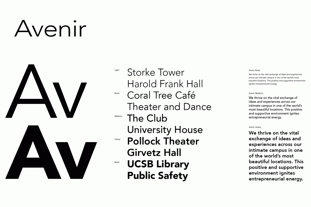
In drawing the Avenir® typeface, Adrian Frutiger looked to both the past and the future for inspiration. His goal was to reinterpret the geometric sans serif designs of the early part of the 20th century in a typeface that would portend aesthetics of the 21st century. He succeeded handsomely. In doing so, Frutiger added a bit of organic humanism to the design, freeing Avenir from the rigid geometric overtones of the earlier designs. Avenir is employed on signage at Dallas Fort Worth and Hong Kong international airports. The city of Amsterdam adopted Avenir as its corporate typeface in 2003. The original Avenir family is made up of designs with gradual weight changes in order to satisfy the needs of specific text applications. While the book and light weights have similar stroke widths, the book weight is well suited for body text, whereas the light was designed for captions and subhead text.


